
It’s now as simple as clicking on a link to Google’s template to make a bubble chart in Google Data Studio. Google has designed and published a free template for visualizing your Search Console data as a bubble chart.
This makes utilizing a bubble chart to evaluate Search Console data easier than ever before – a task that previously required the use of third-party tools.
The graph was created by Google to assist you in determining which inquiries are performing well for your site and which may be improved. It can detect associations between variables since it uses an X and Y axis to display data as a circle on a graph.
The capacity to graph data with numerous dimensions on the same graph is a major advantage of utilizing a bubble chart. Users may look up a query and examine its click-through rate (CTR), average position, and number of clicks all at once using Google’s bubble chart template for Data Studio.
The information is graphed in three dimensions: desktop, mobile, and tablet. This allows you to quickly identify queries that rank well on mobile but have a poor CTR, for example, by looking at the chart.
Google also provides instructions on how to use the template to extract your most critical information. All of this is detailed in the newest chapter of Google Search Advocate Daniel Waisberg’s Google Data Studio blog series.
Before you can receive free updates, link building strategies or SEO tips you need to confirm your email right now.
(It’s easy)
Just go to your inbox, open the confirmation email from the SIA, and click the link.
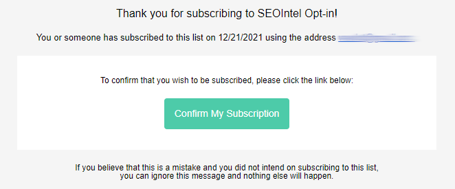
And that’s it!
PS: If you don’t see a confirmation email, please check your spam/junk or promotions folders. Sometimes the confirmation message ends up there by mistake.
Obtenez nos 7 études S.I.A. les plus controversées qui feront trembler la tête même les SEO les plus avancés d’incrédulité.
De plus, nous vous alerterons lorsque nous publierons de nouveaux tests au public.
Obtenga nuestros 7 estudios S.I.A. más controvertidos que harán que incluso el SEO más avanzado sacuda la cabeza con incredulidad.
Además, le avisaremos cuando publiquemos nuevas pruebas al público.
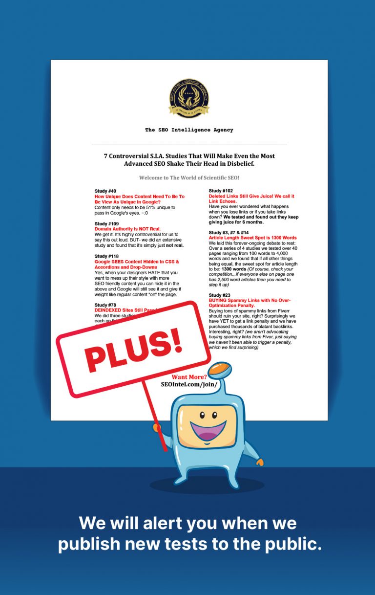
Get Our Most 7 Controversial S.I.A. Studies That Will Make Even the Most Advanced SEO Shake Their Head in Disbelief.
Plus we will alert you when we publish new tests to the public.