In the world of website analytics, there are various metrics that can provide valuable insights into user behavior and website performance.
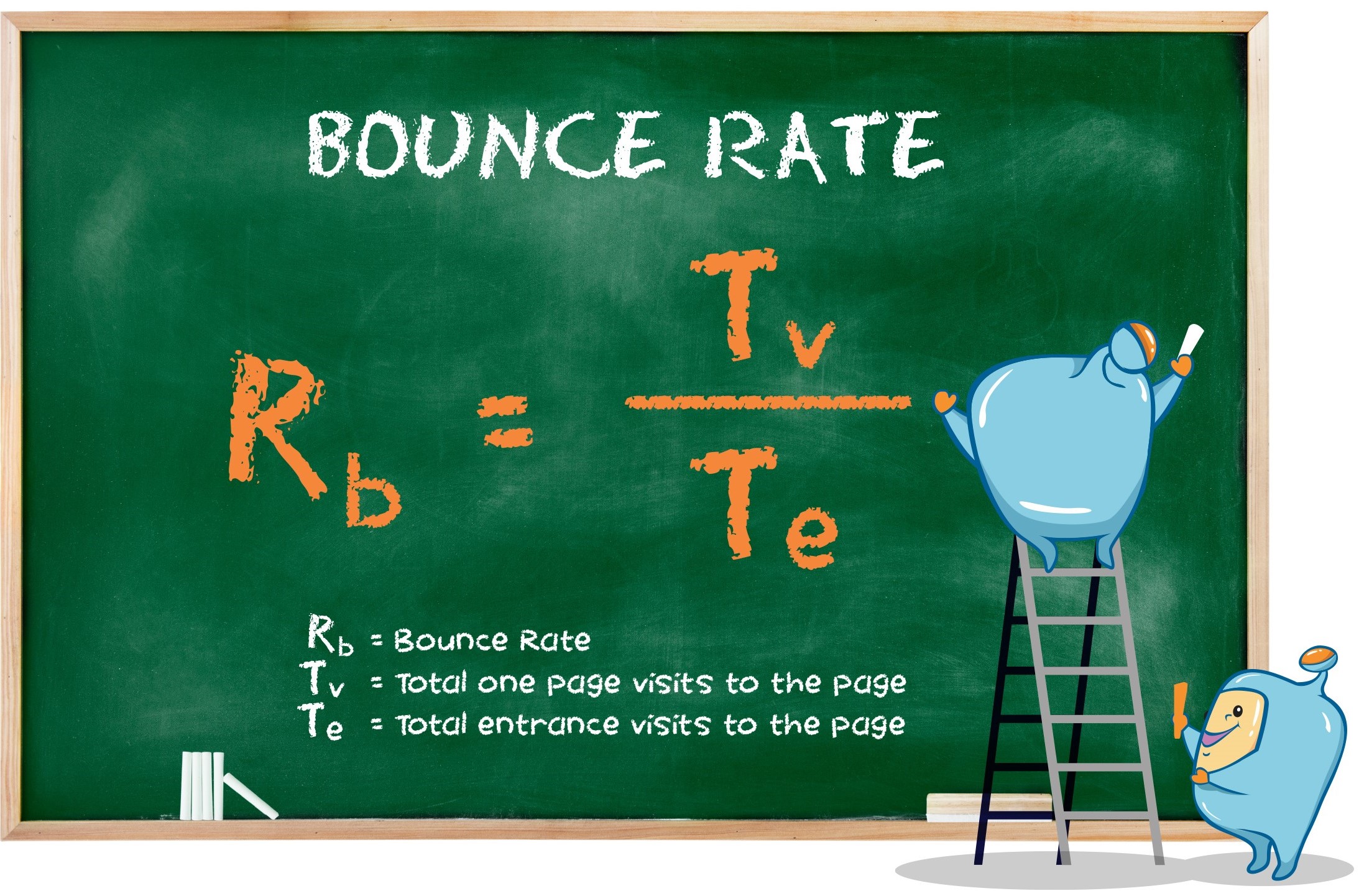
One such metric is the bounce rate, which measures the percentage of visitors who leave a webpage without taking any action, such as clicking on a link, filling out a form, or making a purchase.
In this article, we will delve into the concept of bounce rate, its importance, and how it can be improved to enhance user engagement and conversions on your website.
Here is what you will read in this article:
- What Is Bounce Rate?
- The Importance of Bounce Rate
- 1. Conversion Rate Optimization
- 2. Impact on Search Engine Rankings
- 3. Indicators of Website Issues
- Understanding Average Bounce Rates
- Differentiating Bounce Rate and Exit Rate
- Common Reasons for Bouncing
- 1. Page Doesn't Meet Expectations
- 2. Ugly Design
- 3. Bad User Experience (UX)
- 4. Meeting Search Intent
- Strategies to Improve Bounce Rate and Enhance User Engagement
- 1. Embed YouTube Videos On Your Page
- 2. Sprinkle In Bucket Brigades
- 3. Loading Speed Optimization
- 4. Use The PPT Introduction Template
- 5. Make Your Content Super Easy to Read
- 6. Satisfy Search Intent
- 7. Turn Donkeys Into Unicorns
- 8. Use Heatmap Data to Improve Key Landing Pages
- 9. Add Internal Links to Your Page
- 10. Impress Visitors With Amazing Design
- 11. Use a Table of Contents (With "Jumplinks")
- 12. Optimize Your Mobile UX
- 13. Link to Related Posts and Articles
- 14. Use Exit-Intent Popups
- 15. Use Content Upgrades
- Conclusion

What Is Bounce Rate?
Bounce rate is a metric that indicates the percentage of visitors who land on a webpage and then leave without interacting with the page in any meaningful way.
A high bounce rate suggests that visitors are not finding what they are looking for or that the webpage fails to engage them effectively.
On the other hand, a low bounce rate indicates that visitors are exploring the website further, indicating higher user engagement.

The Importance of Bounce Rate
Bounce rate is important for several reasons, and understanding its significance can help website owners and marketers optimize their webpages and improve overall user experience.
Here are three key reasons why bounce rate matters:
1. Conversion Rate Optimization:
When a visitor bounces from your site, it means they did not convert, whether that conversion involves making a purchase, signing up for a newsletter, or completing a desired action.
By reducing the bounce rate, you can potentially increase your conversion rate and achieve better results from your website.
2. Impact on Search Engine Rankings:
Bounce rate has been found to have a correlation with search engine rankings, particularly on Google.
Several studies have indicated that webpages with lower bounce rates tend to rank higher on search engine result pages.
This suggests that search engines consider bounce rate as a potential ranking factor, making it essential to optimize your website's bounce rate to improve its visibility in search results.
3. Indicators of Website Issues:
A high bounce rate can signal underlying issues with your website's content, user experience, page layout, or copywriting.
By monitoring and analyzing bounce rate data, you can identify areas for improvement and take necessary actions to enhance the overall quality and engagement of your webpages.

Understanding Average Bounce Rates
While it is useful to have a benchmark for bounce rates, it is important to note that average bounce rates can vary significantly across industries and traffic sources.
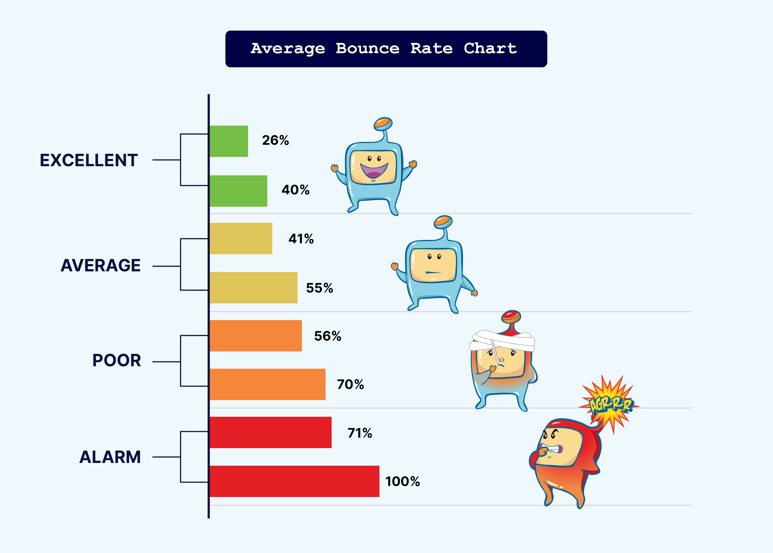
According to a report on GoRocketFuel.com, the average bounce rate range falls between 41% and 51%.
However, it is crucial to consider your specific industry and traffic sources when determining what constitutes a "good" bounce rate for your website.
Different types of websites tend to have distinct average bounce rates.
For example, ecommerce sites typically have lower average bounce rates ranging from 20% to 45%, while blogs often experience higher bounce rates that can reach up to 90%.
Therefore, when evaluating your website's bounce rate, it is essential to compare it with similar sites within your industry and consider the nature of your website's content and purpose.
Furthermore, the source of your website's traffic can significantly influence its bounce rate.
ConversionXL discovered that email and referral traffic tend to have lower bounce rates, while display ads and social media traffic often result in higher bounce rates.
Understanding these variations and analyzing traffic sources can help you gain a better understanding of your website's bounce rate and its underlying factors.

Differentiating Bounce Rate and Exit Rate
While bounce rate and exit rate are related metrics, they measure slightly different aspects of user behavior on a website.
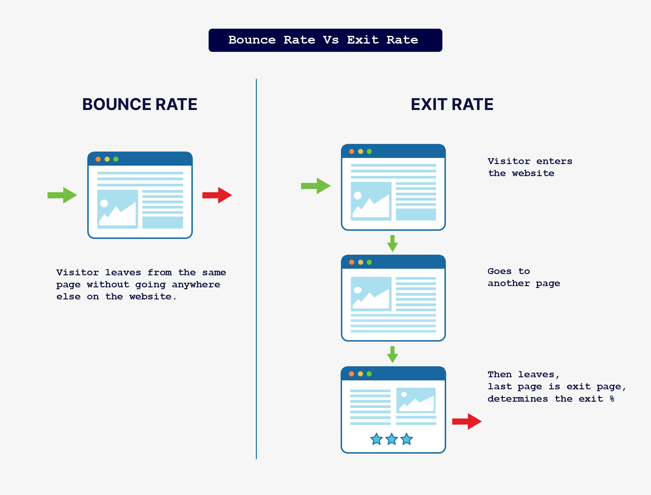
Bounce rate specifically refers to the percentage of visitors who leave a webpage without any engagement, while exit rate measures the percentage of visitors who leave a specific page, regardless of whether they landed on that page or not.
Understanding the distinction between bounce rate and exit rate is important for analyzing user behavior on your website.
While both metrics provide insights into user engagement and page performance, they offer different perspectives on how visitors interact with your website.

Common Reasons for Bouncing
Before diving into strategies to reduce bounce rate, it's essential to understand the common reasons why visitors bounce from a website.
By identifying these factors, you can address them and create a more engaging and user-friendly experience for your audience.
Here are some common reasons for bouncing:
1. Page Doesn't Meet Expectations:
Visitors may leave a page if it fails to deliver what was promised in the search results or the ad that brought them to the website.
If the content or offerings on the page do not align with their expectations, they are likely to bounce and search for a more relevant page.
2. Ugly Design:
Poorly designed websites with cluttered layouts, difficult-to-read text, or unappealing visuals can drive visitors away.
Aesthetics play a crucial role in capturing and retaining visitors' attention, so investing in a visually appealing design is essential.
3. Bad User Experience (UX):
Visitors expect websites to be easy to navigate, with clear and intuitive user interfaces.
If your website has a confusing or frustrating UX, with slow loading times, broken links, or complex navigation, visitors are more likely to bounce in search of a better user experience.
4. Meeting Search Intent:
Sometimes, a bounce is not necessarily a negative outcome.
If a visitor finds exactly what they were looking for on a specific page and leaves immediately after obtaining the desired information, it can be considered a successful engagement.
Understanding and aligning your content with user search intent can help differentiate between positive and negative bounces.

Strategies to Improve Bounce Rate and Enhance User Engagement
1. Embed YouTube Videos On Your Page
Adding videos to your webpages can significantly impact user engagement and reduce bounce rates.
Research conducted by Wistia, a video hosting company, found that including videos on their pages more than doubled their average time on page.
Similarly, embedding videos can lead to a lower bounce rate and increased time spent on your website.
By incorporating relevant and engaging videos on your pages, you can provide additional value to your visitors, keep them entertained, and encourage them to explore further.
You don't necessarily have to create your own videos; you can embed relevant videos from platforms like YouTube that complement your page's content.
2. Sprinkle In Bucket Brigades
Bucket Brigades are phrases or statements strategically placed within your content to capture and maintain the reader's attention.
These phrases act as transitional hooks that make readers curious to continue reading.
By using Bucket Brigades, you can break up long blocks of text, enhance readability, and reduce bounce rates.
For example: instead of having a paragraph with a generic statement, you can use a Bucket Brigade phrase like "Check this out" or "With that..." to create intrigue and encourage readers to keep reading.
By strategically placing these attention-grabbing phrases throughout your content, you can hook readers and entice them to stay on the page longer, ultimately reducing the bounce rate.

3. Loading Speed Optimization
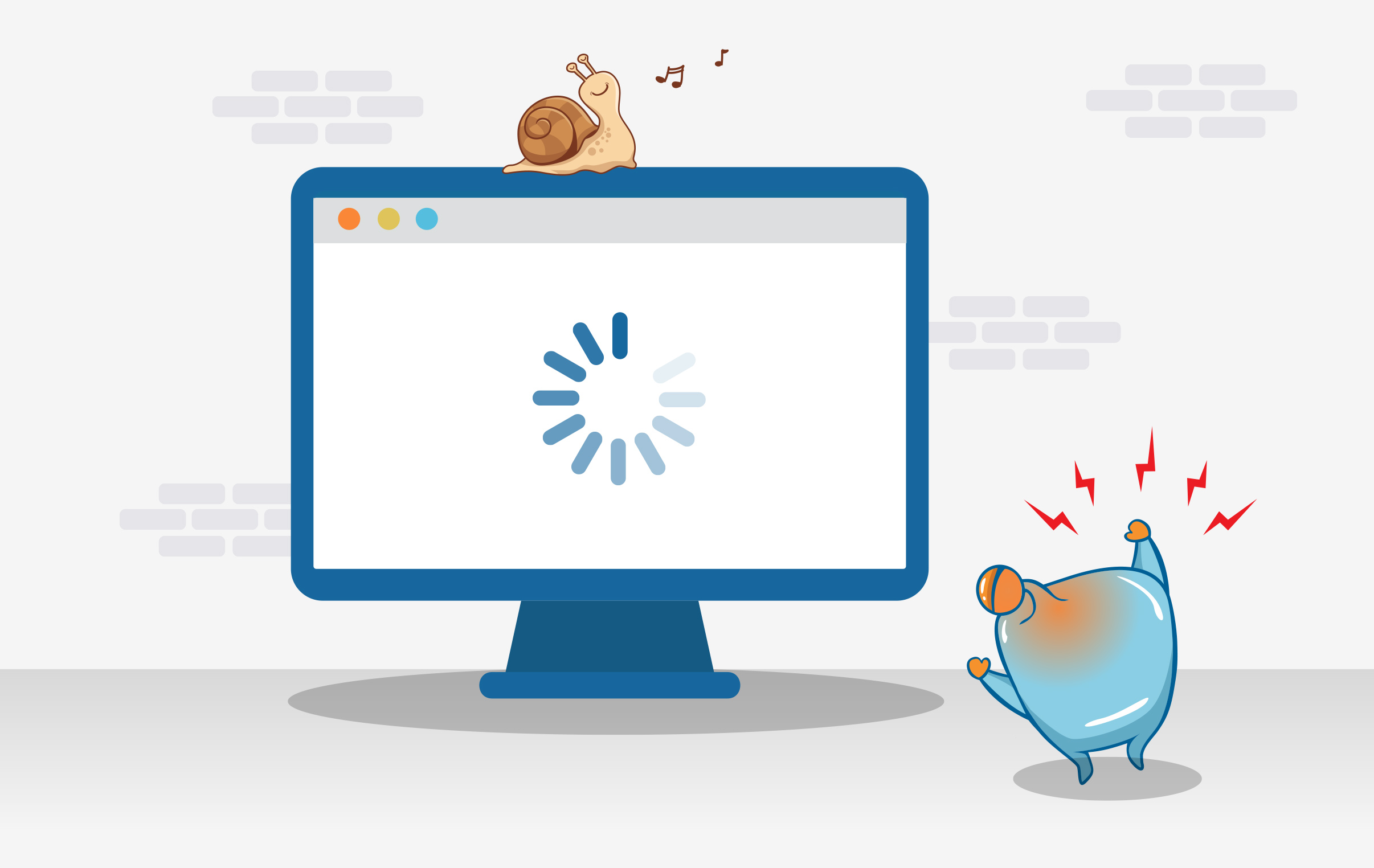
Website loading speed is a critical factor in user experience and bounce rate.
Users expect websites to load quickly, and if a page takes too long to load, they are more likely to abandon it.
According to a Google analysis of 11 million landing pages, slow loading speed is correlated with higher bounce rates.
To optimize loading speed, start by benchmarking your website's performance using tools like Google's PageSpeed Insights.
This tool analyzes your page's code and provides recommendations to improve loading speed.
Some common optimization techniques include:
- Compressing Images: Large image file sizes can significantly slow down a webpage.
Use image compression tools to reduce file sizes without compromising quality.
- Using a Fast Hosting Provider: The hosting provider you choose plays a crucial role in your website's loading speed.
Consider upgrading to a reliable hosting provider that offers faster loading times.
- Removing Unused Plugins and Scripts: Unused plugins and scripts can add unnecessary weight to your website, impacting loading speed.
Regularly review and remove any plugins or scripts that are not essential for your website's functionality.
4. Use The PPT Introduction Template
Crafting compelling introductions is essential to captivate visitors and encourage them to stay on your page.
The PPT (Promise, Proof, Transition) Introduction Template is an effective approach to create engaging introductions that reduce bounce rates.
Here's how the PPT Introduction Template works:
- Promise: Make a promise to the reader, highlighting what they will gain or learn by reading the content.
Clearly state the value proposition of your page.
- Proof: Provide evidence or proof that supports your promise.
This can include personal experience, case studies, data, or testimonials that establish credibility and build trust with the reader.
- Transition: End the introduction with a smooth transition that encourages readers to continue reading.
This can be a question, a thought-provoking statement, or a preview of what's coming next.
5. Make Your Content Super Easy to Read
Readable content is crucial for keeping visitors engaged and reducing bounce rates.
If your content appears overwhelming, with long paragraphs and dense text, readers may find it difficult to consume and quickly lose interest.
Implement the following strategies to make your content more readable:
- Use Ample White Space: Break up your content with sufficient white space to create a visually appealing and less intimidating layout.
This includes using proper line spacing, margins, and padding to give your content room to breathe.
- Optimize Paragraph Structure: Instead of long paragraphs, break your content into shorter, skimmable paragraphs.
This makes it easier for readers to scan and digest the information.
- Use Appropriate Font Sizes: Ensure your font sizes are legible and comfortable to read, particularly on mobile devices.
Aim for a font size between 15-17px to provide a pleasant reading experience.
- Utilize Section Subheadings: Organize your content using descriptive subheadings that clearly indicate different sections.
This allows readers to navigate through your content easily and find the specific information they are looking for.
6. Satisfy Search Intent
To reduce bounce rates, it's crucial to ensure that your webpages align with user search intent.
Search intent refers to the underlying motivation or goal behind a user's search query and the type of information they are seeking.
When users click on a search result and land on your page, they expect the content to fulfill their search intent.
To satisfy search intent and reduce bounce rates, follow these guidelines:
- Keyword Research: Conduct thorough keyword research to understand the intent behind popular search queries related to your content.
Identify the specific needs, questions, or problems users have when searching for information related to your topic.
- Content Relevance: Create high-quality content that directly addresses and satisfies the search intent of your target audience.
Ensure that your content provides valuable and comprehensive information that aligns with what users expect to find based on their search query.
Content Organization: Structure your content in a logical and organized manner.
Use headings, subheadings, and bullet points to make it easy for users to scan and find the information they need quickly.
- Answer User Questions: Anticipate and address common questions and concerns related to the topic in your content.
This helps users find immediate answers to their queries, increasing their engagement and reducing the likelihood of bouncing.
7. Turn Donkeys Into Unicorns
In your website analytics, you may come across pages with a high bounce rate, often referred to as "donkey" pages.
These are the pages that need improvement to engage visitors and reduce bounce rates.
On the other hand, you may also have pages with a low bounce rate, referred to as "unicorn" pages, which are highly engaging and successful at retaining visitors.
By identifying and analyzing these donkey and unicorn pages, you can gain valuable insights into what works and what needs improvement on your website.
Here's how you can turn donkeys into unicorns:
- Analyze User Behavior: Use analytics tools like Google Analytics to identify pages with high bounce rates.
Look for patterns, such as common characteristics or elements that may contribute to the high bounce rate.
- User Testing: Conduct user testing to gather feedback and insights directly from your target audience.
This can help identify usability issues, confusing elements, or content gaps that may be causing visitors to bounce.
- Content Optimization: Revise and improve the content on donkey pages to make it more engaging, informative, and relevant to user needs.
Consider adding visual elements, updating outdated information, or improving the overall readability and structure of the page.
- User Experience Enhancements: Evaluate the user experience on donkey pages and make necessary improvements.
This may involve optimizing page loading speed, fixing broken links, improving navigation, or enhancing mobile responsiveness.

8. Use Heatmap Data to Improve Key Landing Pages
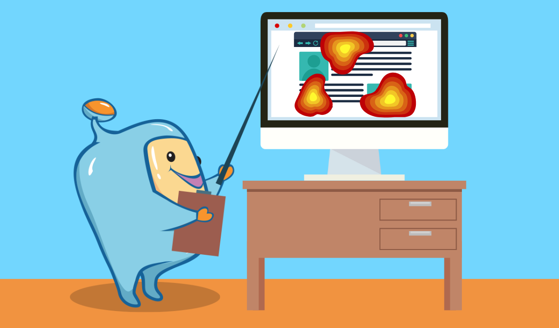
Heatmap tools, such as CrazyEgg and Hotjar, provide valuable visual data on user behavior, including where visitors click, how far they scroll, and what elements they engage with the most.
By analyzing heatmap data, you can gain insights into user preferences, identify areas of high engagement, and discover elements that may be causing visitors to bounce.
Here's how you can use heatmap data to improve key landing pages:
- Scroll and Click Behavior: Analyze the scroll and click behavior of visitors to understand which parts of your landing pages receive the most attention and engagement.
Focus on optimizing these high-impact areas to maximize user engagement and reduce bounce rates.
- Element Visibility: Use heatmaps to evaluate the visibility of important elements on your landing pages.
Ensure that key call-to-action buttons, forms, or offers are prominently displayed and easily accessible to visitors.
- Element Performance: Assess the performance of different elements on your landing pages using heatmap data.
Identify elements that receive low interaction or engagement, as these may be contributing to high bounce rates.
Experiment with different variations, positioning, or messaging to improve their performance and capture visitors' attention.
- Mobile Optimization: Heatmaps can provide valuable insights into how visitors interact with your landing pages on mobile devices.
Optimize your landing pages for mobile users by ensuring that elements are easily clickable, text is readable, and the overall layout is responsive and user-friendly.
- Form Optimization: If your landing page includes a form, heatmap data can help identify any usability issues or barriers that may prevent visitors from completing the form.
Evaluate the form's placement, length, and fields to streamline the user experience and encourage form submissions.
9. Add Internal Links to Your Page
Internal linking is an effective strategy for reducing bounce rates and keeping visitors engaged on your website.
By providing relevant internal links within your content, you can encourage visitors to explore additional pages and resources on your site, increasing pageviews and reducing bounce rates.
Here's how you can leverage internal links to improve user engagement:
- Contextual Relevance: Insert internal links naturally within your content, ensuring they are contextually relevant to the topic at hand.
Choose anchor text that accurately describes the linked page, giving visitors a clear understanding of what they can expect by clicking on the link.
- Related Content: Identify related articles, blog posts, or resources on your website that provide additional value or expand upon the current topic.
Include these relevant internal links throughout your content, inviting visitors to delve deeper into the subject matter.
- Navigation Menus: Optimize your navigation menus by including clear and intuitive links to important pages on your site.
This allows visitors to easily explore different sections and find the information they are seeking.
- Call-to-Action Buttons: Incorporate strategic call-to-action buttons throughout your content that lead visitors to relevant landing pages or conversion opportunities.
These buttons can entice visitors to take the desired action, reducing bounce rates and increasing conversions.

10. Impress Visitors With Amazing Design
The visual appeal and design of your website have a significant impact on user engagement and bounce rates.
A poorly designed or unattractive website can deter visitors and lead to high bounce rates.
Conversely, an aesthetically pleasing and well-designed website can captivate visitors, encourage them to explore further and reduce bounce rates.
Consider the following design aspects to impress visitors and improve user engagement:
- Visual Hierarchy: Create a clear visual hierarchy that guides visitors' attention and highlights important elements.
Use contrasting colors, appropriate font sizes, and whitespace effectively to direct focus and make key information easily scannable.
- Intuitive Navigation: Ensure that your website's navigation is intuitive and user-friendly.
Visitors should be able to easily find the information they're looking for and navigate between pages without confusion.
- Consistent Branding: Maintain consistent branding elements, such as logo, colors, and typography, throughout your website.
Consistency creates a cohesive and professional impression, instilling trust in your visitors.
- Engaging Multimedia: Incorporate visually appealing and interactive multimedia elements, such as high-quality images, videos, infographics, or animations, to enhance user engagement.
These elements can capture visitors' attention, communicate information effectively, and reduce bounce rates.
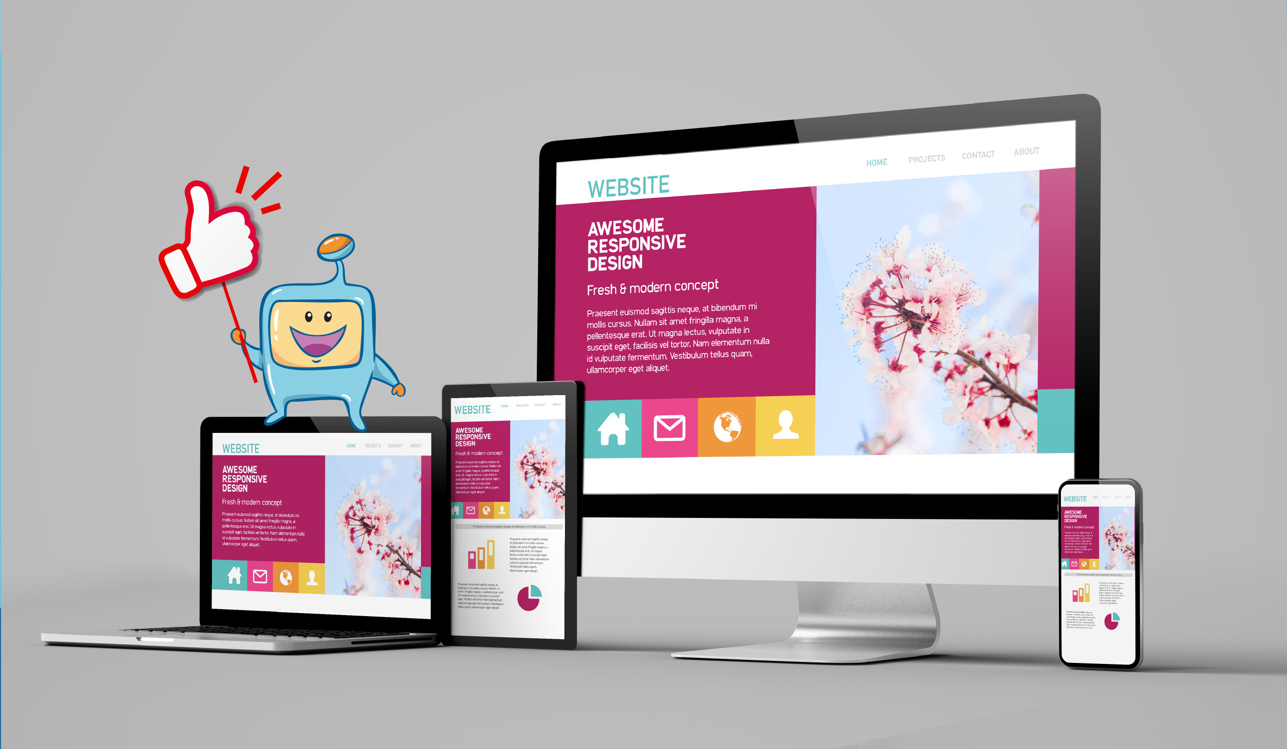
- Responsive Design: Optimize your website for responsiveness across different devices and screen sizes.
Ensure that your design adapts seamlessly to mobile devices, as a significant portion of web traffic comes from mobile users.
11. Use a Table of Contents (With "Jumplinks")
Use a Table of Contents (With "Jumplinks")
Long-form content is valuable for providing in-depth information to your audience.
However, it can also be overwhelming for readers to find specific sections or information within lengthy articles.
By implementing a table of contents with "jumplinks", you can enhance the user experience and make it easier for visitors to navigate and find the information they're seeking.
Here's how to utilize a table of contents with jumplinks effectively:
Create a Table of Contents: Generate a table of contents at the beginning of your long-form content, listing the main sections or subsections covered in the article.
- Anchor Links: Assign anchor links to each section listed in the table of contents.
These anchor links, also known as jumplinks, allow visitors to click on a section title in the table of contents and instantly jump to the corresponding section within the article.
- Clear Formatting and Styling: Ensure that the table of contents is visually distinct from the rest of the content, making it easy to identify and navigate.
Use appropriate formatting, such as bold or larger font size, to differentiate the section titles.
- Sticky or Scrollable Table of Contents: Consider implementing a sticky table of contents that remains visible as visitors scroll down the page.
This allows them to access the table of contents at any point, making navigation even more convenient.
12. Optimize Your Mobile UX
Given the significant increase in mobile traffic, optimizing your website's mobile user experience (UX) is essential for reducing bounce rates.
Mobile users have unique needs and expectations, and a seamless mobile UX can greatly impact visitor engagement and encourage them to stay on your site.
Consider the following mobile optimization strategies:
- Responsive Design: Ensure your website is built with responsive design principles, allowing it to adapt and display properly on various screen sizes and mobile devices.
Test your website across different devices and browsers to ensure a consistent and user-friendly experience.
- Mobile-Friendly Layout: Optimize the layout for mobile devices by using a vertical scrolling format, larger fonts, and appropriately-sized buttons and navigation elements.
Ensure that content is easily readable without excessive zooming or scrolling.
- Fast Loading Speed: Mobile users have limited patience for slow-loading pages.
Optimize your website's loading speed by minimizing file sizes, leveraging browser caching, and using content delivery networks (CDNs) to deliver content efficiently.
- Touch-Friendly Elements: Ensure that buttons, links, and interactive elements are well-spaced and easy to tap on touchscreens.
Avoid using elements that require precise mouse clicks, as they can frustrate mobile users.
- Simplified Forms: If your website includes forms, streamline them for mobile users by reducing the number of required fields and utilizing mobile-friendly input methods, such as dropdown menus and checkboxes.
13. Link to Related Posts and Articles
Linking to related posts and articles within your website's content is an effective strategy to reduce bounce rates and keep visitors engaged.
By providing additional relevant content options, you encourage visitors to explore more of your website and spend more time on it.
Consider the following practices when linking to related posts and articles:
- Contextual Relevance: Link to related content and ensure that the linked content provides additional valuable information, expands on the topic, or offers a different perspective to enhance the user's understanding or provide further insights.
- Strategic Placement: Insert internal links to related posts and articles at natural break points within your content, such as after discussing a concept or introducing a new topic.
This allows visitors to dive deeper into specific areas of interest without disrupting their reading flow.
- Anchor Text Optimization: Use descriptive and compelling anchor text for your internal links.
Avoid generic phrases like "click here" and instead use keyword-rich anchor text that accurately represents the linked content.
This helps visitors understand what they can expect when they click on the link and encourages them to explore further.
- Visual Cues: Consider using visual cues, such as callout boxes or styled text, to draw attention to the internal links within your content.
Highlighting related posts or articles can make them more noticeable and increase the likelihood of visitors clicking on them.
- Related Post Sections: Include a dedicated section at the end of your content that showcases related posts or articles.
This section can provide a curated list of relevant resources for further reading, enticing visitors to continue their journey on your website.
14. Use Exit-Intent Popups
While popups can sometimes be seen as intrusive, exit-intent popups offer an opportunity to engage visitors who are about to leave your website.
These popups are triggered when a user's mouse movement indicates an intent to exit the page.
Exit-intent popups can provide a last-ditch effort to capture the attention and interest of visitors who are on the verge of leaving your website.
Consider the following practices when using exit-intent popups:
- Value-Oriented Offers: Craft compelling offers or incentives that provide value to the visitor.
This could include discounts, exclusive content, free resources, or subscriptions to newsletters.
The goal is to offer something relevant and enticing enough to make visitors reconsider their decision to leave.
- Minimal Disruption: Ensure that exit-intent popups are designed to be unobtrusive and respectful of the user's browsing experience.
Use subtle animations, clear close buttons, and avoid overwhelming the visitor with excessive text or graphics.
- Targeted Messaging: Customize the messaging of your exit-intent popups based on the specific page or content the visitor is leaving.
Tailor the message to address their potential concerns, offer a solution, or highlight additional relevant content that might pique their interest.
- A/B Testing: Experiment with different popup designs, offers, and messaging to identify what resonates best with your audience.
Conduct A/B tests to compare different variations and optimize the performance of your exit-intent popups.

15. Use Content Upgrades
Content upgrades are highly specific lead magnets that offer additional valuable content related to the topic of your main article or page.
They provide visitors with an incentive to stay on your site, engage further, and provide their contact information in exchange for the upgraded content.
Consider the following steps when implementing content upgrades:
- Identify Relevant Upgrades: Analyze your existing content and identify opportunities to create content upgrades that provide supplementary information, templates, checklists, or additional resources related to the main content.
These upgrades should be highly relevant and valuable to your target audience.
- Create Compelling Calls-to-Action: Integrate clear and visually appealing calls-to-action (CTAs) within your content to promote the content upgrade.
Use persuasive language and design elements that capture visitors' attention and entice them to click on the CTA.
- Opt-In Forms: Create opt-in forms that capture visitors' contact information in exchange for the content upgrade.
Keep the form simple and only request essential information, such as name and email address.
You can use plugins or tools to create visually appealing and user-friendly opt-in forms that seamlessly integrate with your website.
- Delivery of Content Upgrade: Once visitors provide their contact information, ensure a smooth delivery of the content upgrade.
This can be done through automated email sequences or by providing an immediate download link on a confirmation page.
Make sure the content upgrade is easily accessible and meets the promised value.
- Personalization and Segmentation: Consider personalizing the content upgrade experience based on visitors' interests or behavior.
You can segment your audience and offer different content upgrades tailored to specific segments, ensuring a more personalized and engaging experience.
- Track and Analyze Results: Monitor the performance of your content upgrades using analytics tools or tracking software.
Track metrics such as conversion rates, bounce rates, and engagement to evaluate the effectiveness of your content upgrades and make data-driven optimizations.
Conclusion
Bounce rate is a critical metric that provides valuable insights into user behavior and the effectiveness of web pages.
By understanding the factors that contribute to a high bounce rate and implementing strategies to reduce it, you can enhance user engagement, improve conversions, as well as optimize your website's performance.
From optimizing loading speed and improving mobile-friendliness to providing relevant and engaging content, there are various approaches to address bounce rate.
Continuously monitor and analyze your bounce rate data, experiment with different techniques, and make data-driven optimizations to create a more user-friendly and engaging website.
By prioritizing user experience and employing effective bounce rate reduction strategies, you can maximize the potential of your websites and achieve your goals.


