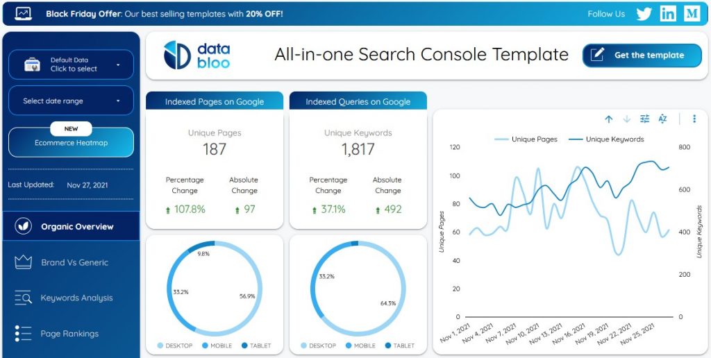
The interactive reports that you can create inside of Google Data Studio can help you to portray an image of cutting-edge professionalism.
Also, when you create an interactive report for someone, you allow that person to manipulate the data and see the outcome of a hypothetical what-if.
But before I go much further, if you’re not sure what Google Data Studio is, I think of it in terms of blended data sources.
I say that because you can combine the data of various Google platforms, such as Analytics and Search Console, to get a more holistic view of things.
(That said, you don’t need Data Studio to combine Google data sources.)
I wrote an article on the idea of blended data, which you can read here: Google Data Studio: Google Tweets New Article on Blended Data Sources.
You might also find this article helpful: Google Data Studio Tutorial: How to Create Reports in Data Studio.
Anyway, onto our actual subject:
Did you know that you can create beautiful, interactive reports in Google Data Studio?
And, you don’t have to start from scratch. The tweet above links to a gallery where you can find templates.
Also, this video serves as a good tutorial:
With the resources listed here, you should have plenty to help you to create interactive reports using Google’s Data Studio.
Source: Google Analytics Twitter channel
Before you can receive free updates, link building strategies or SEO tips you need to confirm your email right now.
(It’s easy)
Just go to your inbox, open the confirmation email from the SIA, and click the link.
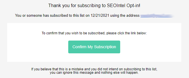
And that’s it!
PS: If you don’t see a confirmation email, please check your spam/junk or promotions folders. Sometimes the confirmation message ends up there by mistake.
Obtenez nos 7 études S.I.A. les plus controversées qui feront trembler la tête même les SEO les plus avancés d’incrédulité.
De plus, nous vous alerterons lorsque nous publierons de nouveaux tests au public.
Obtenga nuestros 7 estudios S.I.A. más controvertidos que harán que incluso el SEO más avanzado sacuda la cabeza con incredulidad.
Además, le avisaremos cuando publiquemos nuevas pruebas al público.
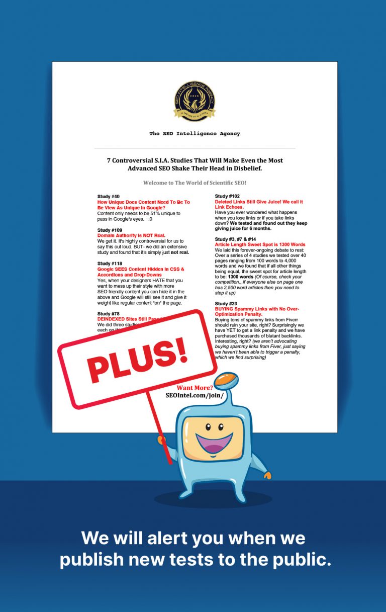
Get Our Most 7 Controversial S.I.A. Studies That Will Make Even the Most Advanced SEO Shake Their Head in Disbelief.
Plus we will alert you when we publish new tests to the public.