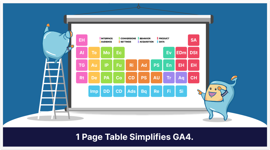
If you took chemistry in high school, you may remember seeing the Periodic Table of Elements. If you saw a colorful chart, you probably saw how different elements were gathered together and in color-coded groups.
That may have helped you learn about the different elements.
Well, for the sake of learning GA4, there’s something similar: Google, via the Google Analytics Twitter channel, retweeted a tweet from Jeff Sauer.
If you haven't already taken a look at our Periodic Table of Google Analytics 4…
— Jeff Sauer (Jeffalytics) (@jeffalytics) August 12, 2021
Then what are you waiting for?! 😲
See it here and let us know what you think: https://t.co/txSvmgVVEZ pic.twitter.com/UNKGWeGttQ
As you can see, the tweet featured an image reminiscent of the Periodic Table of Elements, except that it’s appropriately titled Periodic Table of Google Analytics 4, and like its chemistry counterpart, it has a color-coded key that groups each of its 30+ items into 8 groups.
These 8 groups are:
Interface
It all starts here. You can browse data in new ways–in fact, that’s part of what makes GA4 a bit more evolved than its earlier counterpart.
Audience
These are what you use to create custom audiences (and, I’d imagine, predictive audiences).
Conversions
Within the Conversions group are various reports. You can also see information on funnels, in-app purchases, and e-commerce purchases.
Settings
These include reporting identity, custom dimensions, administrator settings, property settings, and user management.
Behavior
The ‘elements’ in this group allow you to see what pages people looked at, events that occurred, and how engaged people were.
Acquisition
These have to do with how your site is acquiring visitors.
Product
Although most of the ‘elements’ in this group have to do more with GA4 than the users, there is one interesting one: User Properties.
Data
With 8 ‘elements,’ this is the biggest group, and that’s understandable, as GA4 is a data-based platform.
To get this chart, you just have to go to the appropriate page and submit your email. You then get an email with a link to the one-page color-coded chart, which you download and print (and even laminate) so that you can have it by your side when you’re working.
If you’ve been striving to learn Google Analytics 4, and you’re open to different ways of learning, this might be the tool you need.