Google enhances menus looking more modern and improved aesthetics.
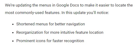
The change was disclosed in a blog post by Google, who stated that it was made to make it easier to find the most regularly used functions by using condensed menus and prominent icons. The following is how Google described the change:

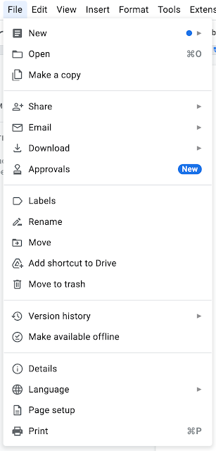
Though the core of the site remains unchanged, several sections have been restructured and grouped to make navigation easier and faster. The “New,” “Open,” and “Make a copy” options, for example, have been clustered at the top, while “Share” has been pushed down with the sub-menus. The main “Add-Ons” menu has been replaced with a new “Extensions” menu that covers everything Apps Script and Add-Ons related.

This new look will be the default for all Google accounts (Workspace and Personal), with a full deployment expected by the end of May. Although it hasn’t yet touched any of my accounts, I can see how much of an improvement this is just by looking at the screenshots above, and I feel it will go a long way toward helping people navigate Docs.