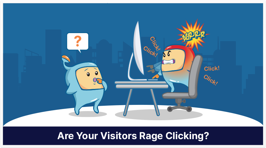
Last week, I was on the sales page of an offer I was considering. On the sales page was a video, but I couldn’t easily see the price.
Out of curiosity, I clicked on the payment link–or, what I thought was the payment link. My intent was to be taken to the payment page so that I’d see the price.
But that didn’t happen.
So, I clicked again, and still nothing happened.
You’ve probably had a similar experience: you click on a link…and nothing happens. You click and click, and still…nothing.
This repeated clicking, according to a July 2021 post on Microsoft Bing Blogs, is called rage clicks.
It’s frustrating for you and I, and it’s frustrating for the user experience of our visitors.
Rage clicks can occur for a number of reasons:
-A person thinks that something is clickable, when it’s not.
-A broken or dead link
-What looks like a video player, but is really just an image.
What Rage Clicks Mean for User Experience (UX)
Quite simply, rage clicks can lead to a bad user experience.
The tricky thing about rage clicks is that it can be difficult to spot them. Unless you’re willing to go through your entire site and click on everything, it’s hard to know for sure if they occur, which page(s), and where on the page(s) they occur.
Resolving Rage Clicks
Microsoft has a free heatmap and session-recording service called Clarity, which offers insight into rage clicks.
Basically, with Clarity, you can see where rage clicks occur, and you decide how you want to fix those issues.
Source: Microsoft Bing Blogs